


Psycho Bunny
Freelance
Psycho Bunny
Freelance

Timeline: June 2024 - January 2025
Timeline: June 2024 - January 2025

Tools used: Figma, Figma Slides, Notion, Google Forms
Tools used: Figma, Figma Slides, Notion, Google Forms

Role: UX Designer and UX Researcher
Role: UX Designer and UX Researcher
Psycho Bunny is a premium menswear brand with a growing online presence. However, its product listing and search experiences were cluttered and inefficient, contributing to friction in the purchase journey.
My Impact
My Impact
As a freelance UX Designer and Researcher, I redesigned Product Listing Pages (PLP), enhanced collection pages, and optimized the search bar.


Checkout Speed
+15%
Improved checkout speed, enabling a faster and smoother purchase experience.
Wireframes
25+
Created clear, goal-oriented wireframes to streamline user flows and reduce friction.
Screens
40+
Designed intuitive screens focused on clarity, hierarchy, and ease of navigation.
Prototypes
5
Built interactive prototypes to validate ideas and accelerate stakeholder feedback.
Before

After

Redesigning The Search Bar
Redesigning The Search Bar
Psycho Bunny aimed to revamp their search bar to enhance product discoverability and streamline the shopping experience.
Psycho Bunny aimed to revamp their search bar to enhance product discoverability and streamline the shopping experience.
My task was to redesign the search functionality, optimizing it to help users find products faster and reduce the time to checkout.
My task was to redesign the search functionality, optimizing it to help users find products faster and reduce the time to checkout.
RESEARCH
RESEARCH
Analysing Search Bars
Analysing Search Bars
I began by analyzing industry-leading search bars, researching current trends and best practices to identify what works best. I studied brands like Aesop, J.Crew, Everlane, and others to understand effective search functionalities.
I began by analyzing industry-leading search bars, researching current trends and best practices to identify what works best. I studied brands like Aesop, J.Crew, Everlane, and others to understand effective search functionalities.
Here are my key findings from the reserach:
Here are my key findings from the reserach:
Instant Search Suggestions
Instant Search Suggestions
Remains visible and scrolls with the user, ensuring easy access to filtering options without losing their place on the page.
Remains visible and scrolls with the user, ensuring easy access to filtering options without losing their place on the page.
Recent Searches & Quick Access
Recent Searches & Quick Access
Displaying recent searches allows users to quickly revisit previous queries without retyping.
Displaying recent searches allows users to quickly revisit previous queries without retyping.
Category-Based Search Results
Category-Based Search Results
Showing structured category cards (e.g., Polos, Accessories, New Arrivals) when the search bar is clicked helps guide users.
Showing structured category cards (e.g., Polos, Accessories, New Arrivals) when the search bar is clicked helps guide users.
WIREFRAMES
WIREFRAMES
Designing Multiple Search Bars
Designing Multiple Search Bars
After completing my analysis, I began wireframing the search bar, exploring multiple design variations.
After completing my analysis, I began wireframing the search bar, exploring multiple design variations.
I created several versions to present to the E-Commerce Manager, allowing them to compare different approaches and understand how each would impact the website’s usability and product discoverability.
I created several versions to present to the E-Commerce Manager, allowing them to compare different approaches and understand how each would impact the website’s usability and product discoverability.
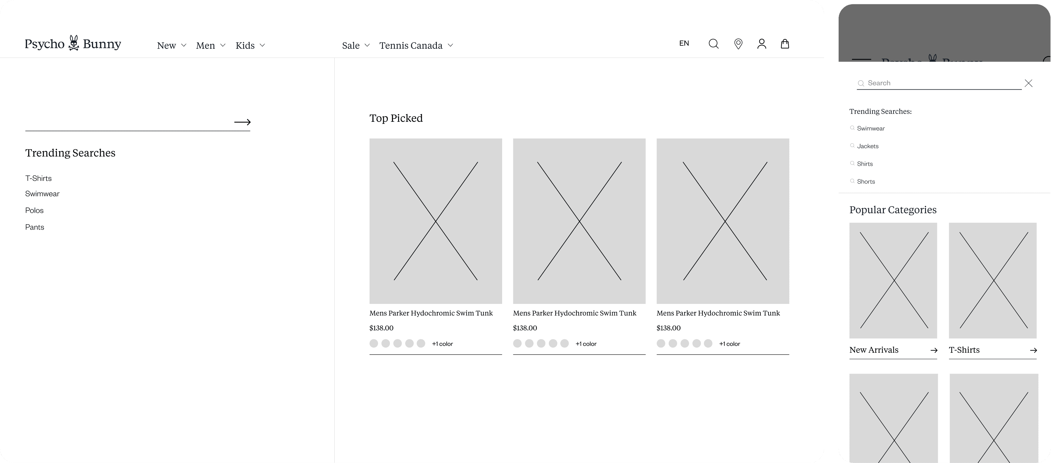

FINAL PRODUCT
FINAL PRODUCT
Finalizing the Search Bar
Finalizing the Search Bar
After submitting the different search bar variations to the E-Commerce Manager, Psycho Bunny ultimately chose Proposition 1.
After submitting the different search bar variations to the E-Commerce Manager, Psycho Bunny ultimately chose Proposition 1.
With their decision finalized, I proceeded to integrate the images and polish the design to create the final version.
With their decision finalized, I proceeded to integrate the images and polish the design to create the final version.
Below is an image showcasing the final product. You can also experience it live on their website, as it has already been implemented.
Below is an image showcasing the final product. You can also experience it live on their website, as it has already been implemented.

Visit Website

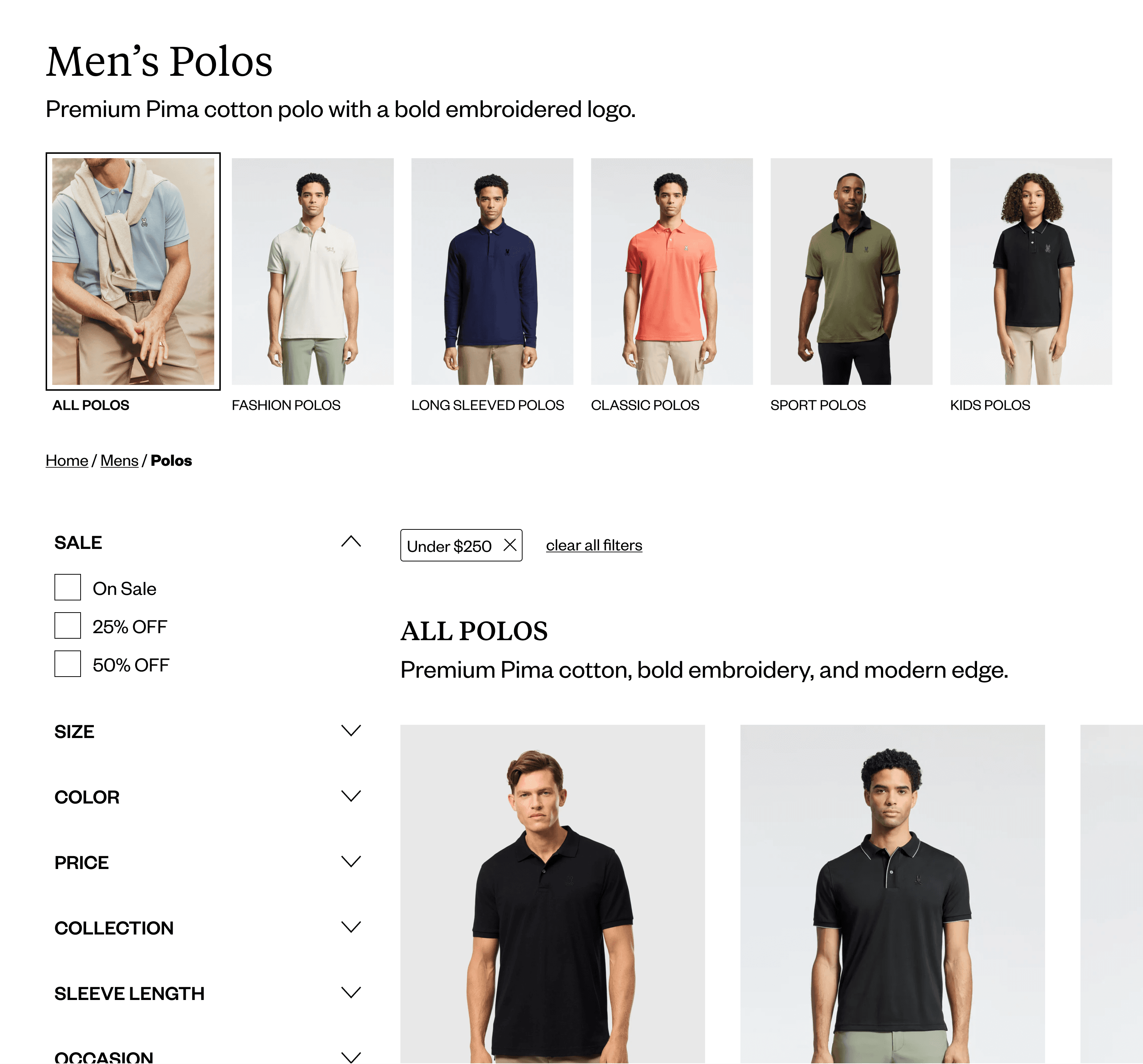
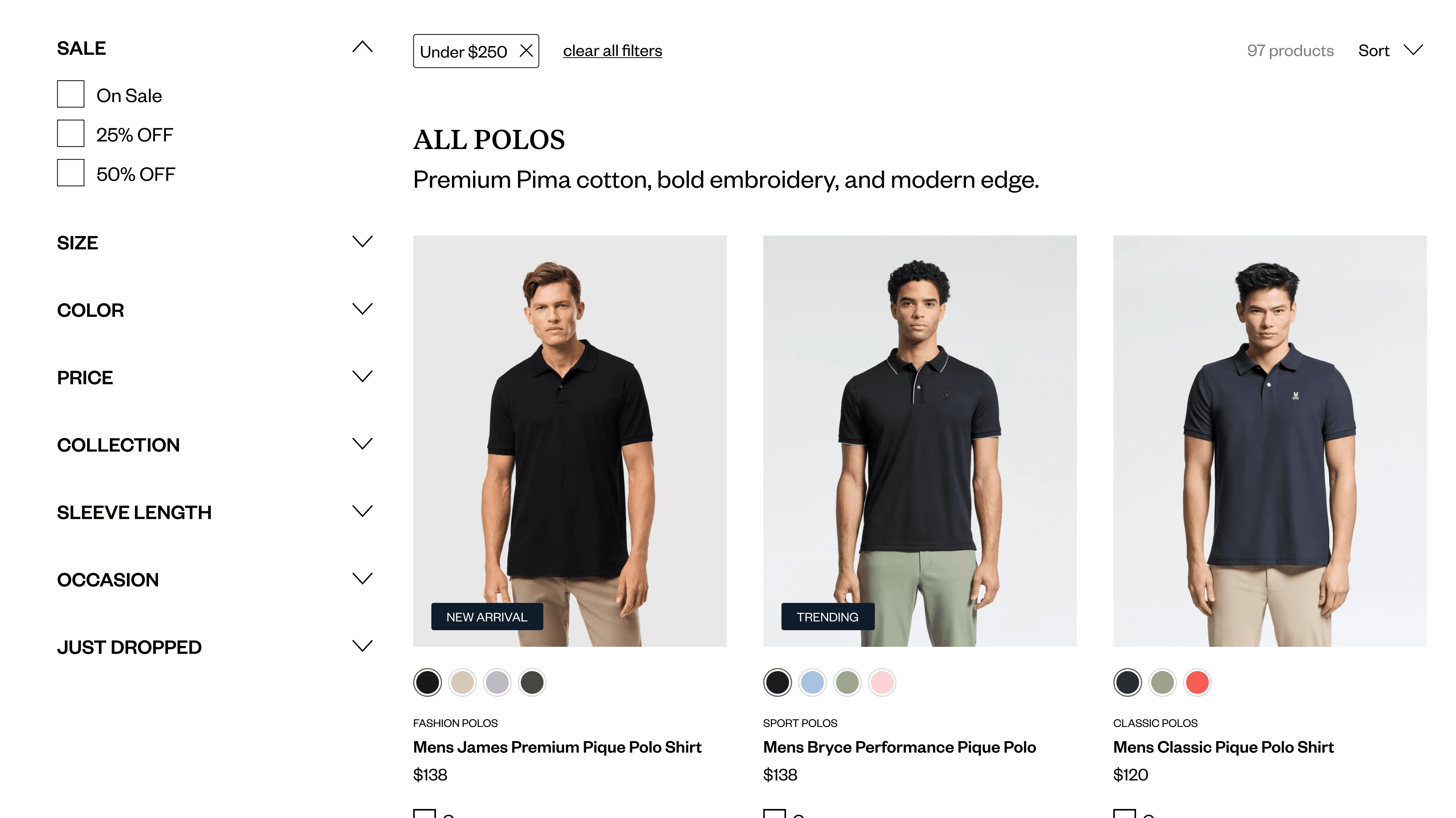
Revamping the Product Listing Page (PLP)
Revamping the Product Listing Page (PLP)
I was tasked with redesigning Psycho Bunny’s Product Listing Page (PLP) to enhance usability, navigation, and product discoverability.
I was tasked with redesigning Psycho Bunny’s Product Listing Page (PLP) to enhance usability, navigation, and product discoverability.
This involved revamping the layout, refining the information hierarchy, and incorporating new features to improve the shopping experience.
This involved revamping the layout, refining the information hierarchy, and incorporating new features to improve the shopping experience.
Additionally, I designed a new badge system to highlight key product details, ensuring a more visually intuitive and engaging interface.
Additionally, I designed a new badge system to highlight key product details, ensuring a more visually intuitive and engaging interface.
MARKET AND USER RESEARCH
MARKET AND USER RESEARCH
Streamlining E-Commerce Navigation
Streamlining E-Commerce Navigation
Before diving into the design process, I conducted market and user research to understand what makes a high-performing Product Listing Page (PLP) and Collection Pages in the current industry landscape.
Before diving into the design process, I conducted market and user research to understand what makes a high-performing Product Listing Page (PLP) and Collection Pages in the current industry landscape.
I analyzed leading e-commerce brands like Skims, Alo Yoga, Lululemon, and many more, studying their layout structures, filtering systems, and visual hierarchy to identify best practices.
I analyzed leading e-commerce brands like Skims, Alo Yoga, Lululemon, and many more, studying their layout structures, filtering systems, and visual hierarchy to identify best practices.
After analyzing leading e-commerce brands, here are the key insights I found:
After analyzing leading e-commerce brands, here are the key insights I found:
Sticky Filter System
Sticky Filter System
Remains visible and scrolls with the user, ensuring easy access to filtering options without losing their place on the page.
Remains visible and scrolls with the user, ensuring easy access to filtering options without losing their place on the page.
Fully Visible Category Image Lists
Fully Visible Category Image Lists
Displays all category images without requiring additional scrolling, making browsing more seamless and efficient.
Displays all category images without requiring additional scrolling, making browsing more seamless and efficient.
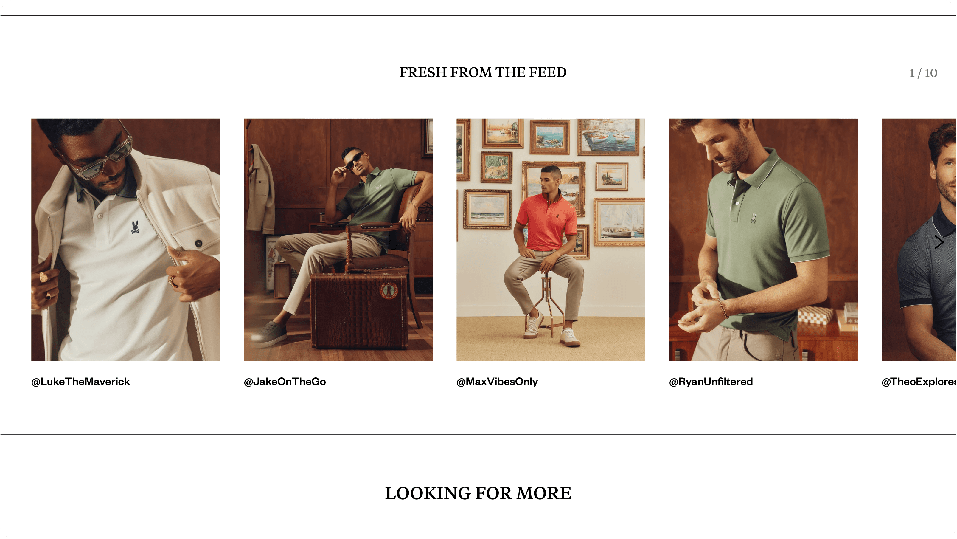
"We Think You’d Like" Section
"We Think You’d Like" Section
Curates personalized recommendations based on a user’s past purchases, enhancing product discovery and engagement.
Curates personalized recommendations based on a user’s past purchases, enhancing product discovery and engagement.
"Looking for More" Section
"Looking for More" Section
Suggests similar or complementary products, encouraging users to explore beyond their initial search.
Suggests similar or complementary products, encouraging users to explore beyond their initial search.
Compare Feature
Compare Feature
Allows users to tick a box and compare multiple items within the same category, making it easier to evaluate options side by side.
Allows users to tick a box and compare multiple items within the same category, making it easier to evaluate options side by side.
Hover Quick-Buy Feature
Hover Quick-Buy Feature
When hovering over a product image, size options appear, enabling users to select and add items to their cart instantly without navigating to the product page.
When hovering over a product image, size options appear, enabling users to select and add items to their cart instantly without navigating to the product page.
After the competitive analysis, I created a SWOT analysis to identify key strengths, weaknesses, opportunities, and threats, guiding strategic design improvements.
After the competitive analysis, I created a SWOT analysis to identify key strengths, weaknesses, opportunities, and threats, guiding strategic design improvements.

View Research in Figma Slides
The Psychology of Scarcity vs. Abundance in E-Commerce
The Psychology of Scarcity vs. Abundance in E-Commerce
After the competitive analysis, I examined the psychological impact of illusion of scarcity vs. illusion of abundance, analyzing how product availability affects user behavior, urgency, and purchasing decisions.
After the competitive analysis, I examined the psychological impact of illusion of scarcity vs. illusion of abundance, analyzing how product availability affects user behavior, urgency, and purchasing decisions.
To validate my findings, I created a pros and cons list and a decision matrix, which confirmed that for Psycho Bunny, the illusion of scarcity would be the most effective approach for driving engagement and conversions.
To validate my findings, I created a pros and cons list and a decision matrix, which confirmed that for Psycho Bunny, the illusion of scarcity would be the most effective approach for driving engagement and conversions.
View Analysis in Figma Slides
After meeting with the E-Commerce Manager and validating my analysis, I began the project with a focus on structural and experiential improvements, as most UI elements had to remain unchanged.
After meeting with the E-Commerce Manager and validating my analysis, I began the project with a focus on structural and experiential improvements, as most UI elements had to remain unchanged.
I was instructed to design the collection pages first, followed by the PLP, with each collection page requiring a tailored approach to maintain consistency, usability, and a seamless browsing experience.
I was instructed to design the collection pages first, followed by the PLP, with each collection page requiring a tailored approach to maintain consistency, usability, and a seamless browsing experience.
WIREFRAMES
WIREFRAMES
Building The Product Listing Page
Building The Product Listing Page
Keeping my analysis in mind, I began wireframing the PLP, incorporating all the necessary features to enhance the user experience.
Keeping my analysis in mind, I began wireframing the PLP, incorporating all the necessary features to enhance the user experience.
Through multiple iterations and collaborative refinements with the E-Commerce Manager, we worked to perfect the page, ultimately arriving at a solution that met Psycho Bunny’s expectations.
Through multiple iterations and collaborative refinements with the E-Commerce Manager, we worked to perfect the page, ultimately arriving at a solution that met Psycho Bunny’s expectations.
Below are a few wireframes for both desktop and mobile, showcasing the redesigned Product Listing Page.
Below are a few wireframes for both desktop and mobile, showcasing the redesigned Product Listing Page.


FINAL PRODUCT
FINAL PRODUCT
Finishing the Product Listing Page
Finishing the Product Listing Page
Once the E-Commerce Manager reviewed the wireframes and provided positive feedback, I moved forward with integrating the final images and polishing the design for a seamless user experience.
Once the E-Commerce Manager reviewed the wireframes and provided positive feedback, I moved forward with integrating the final images and polishing the design for a seamless user experience.
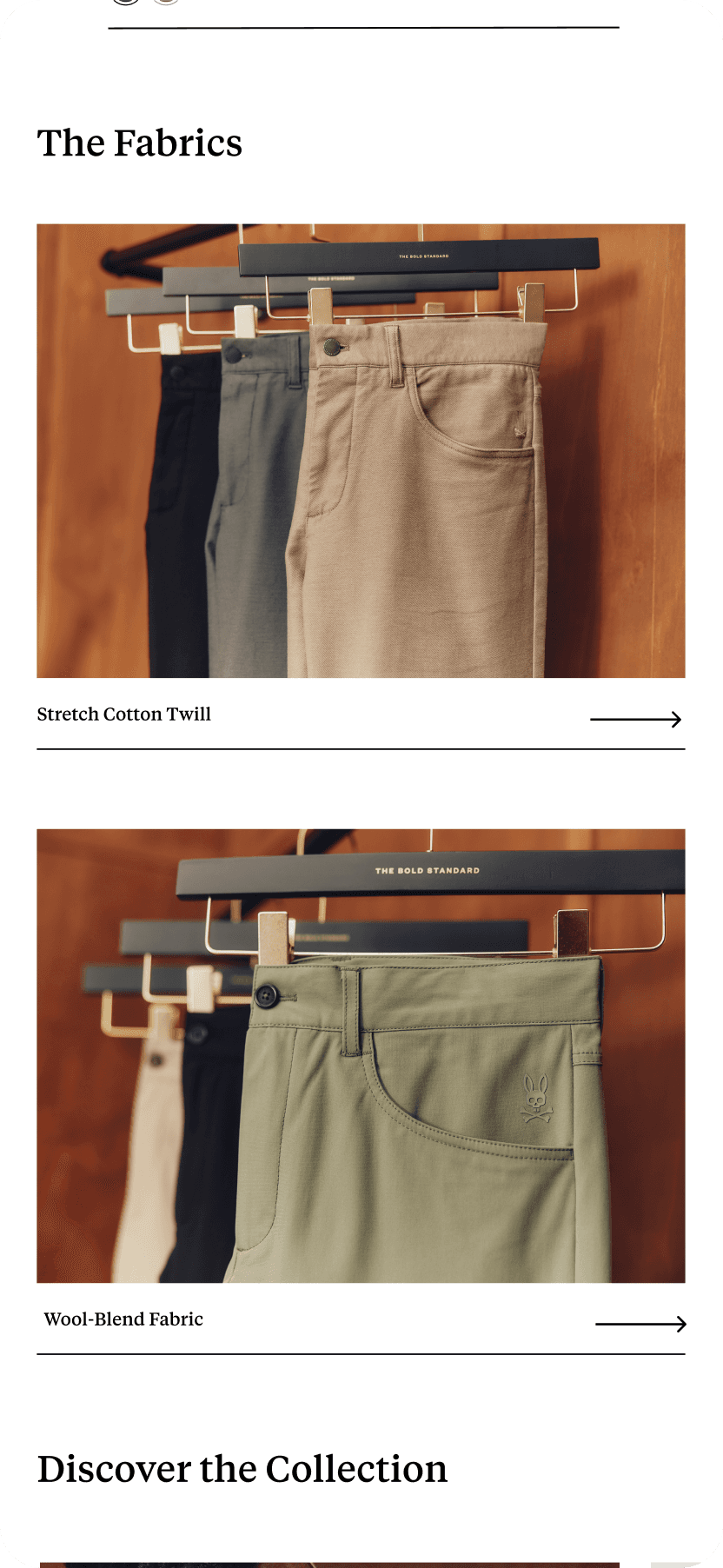
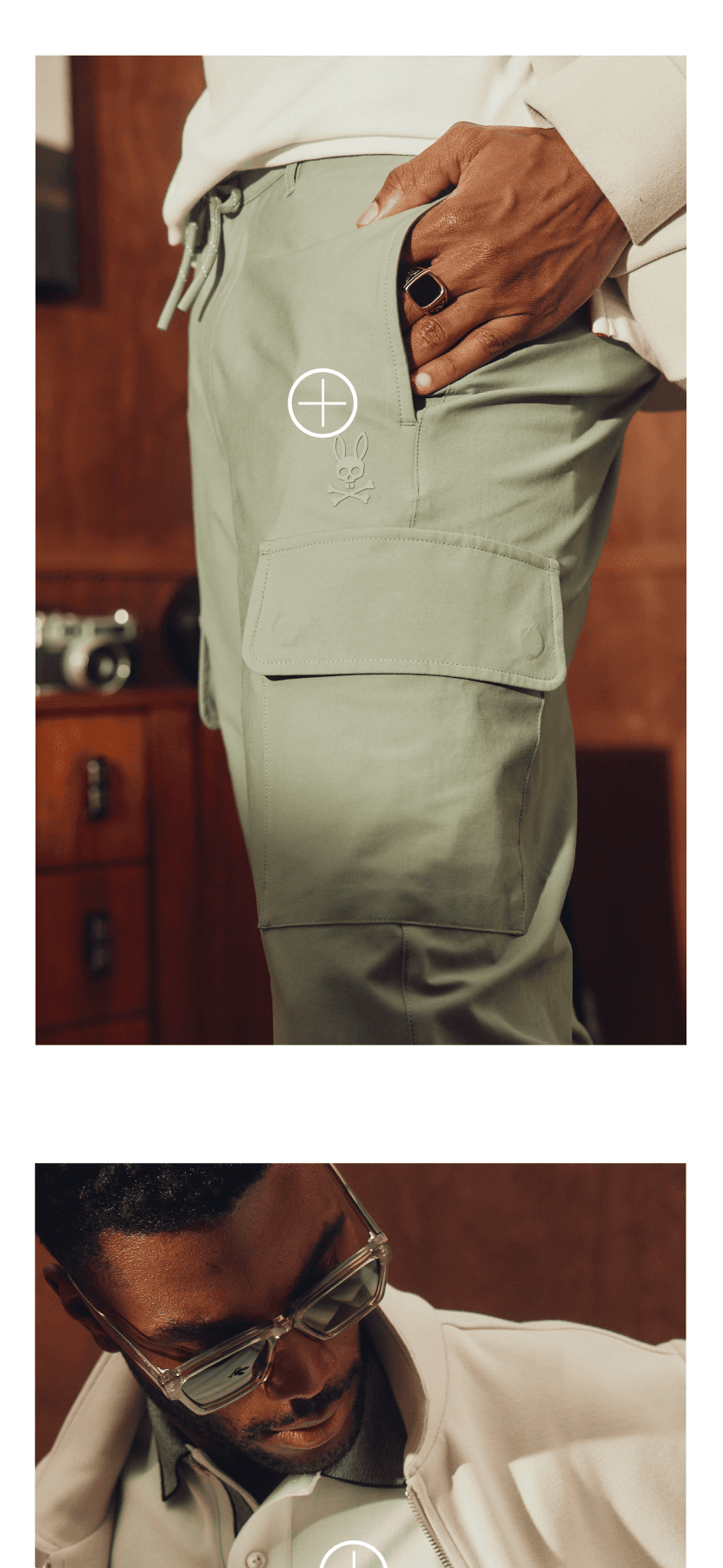
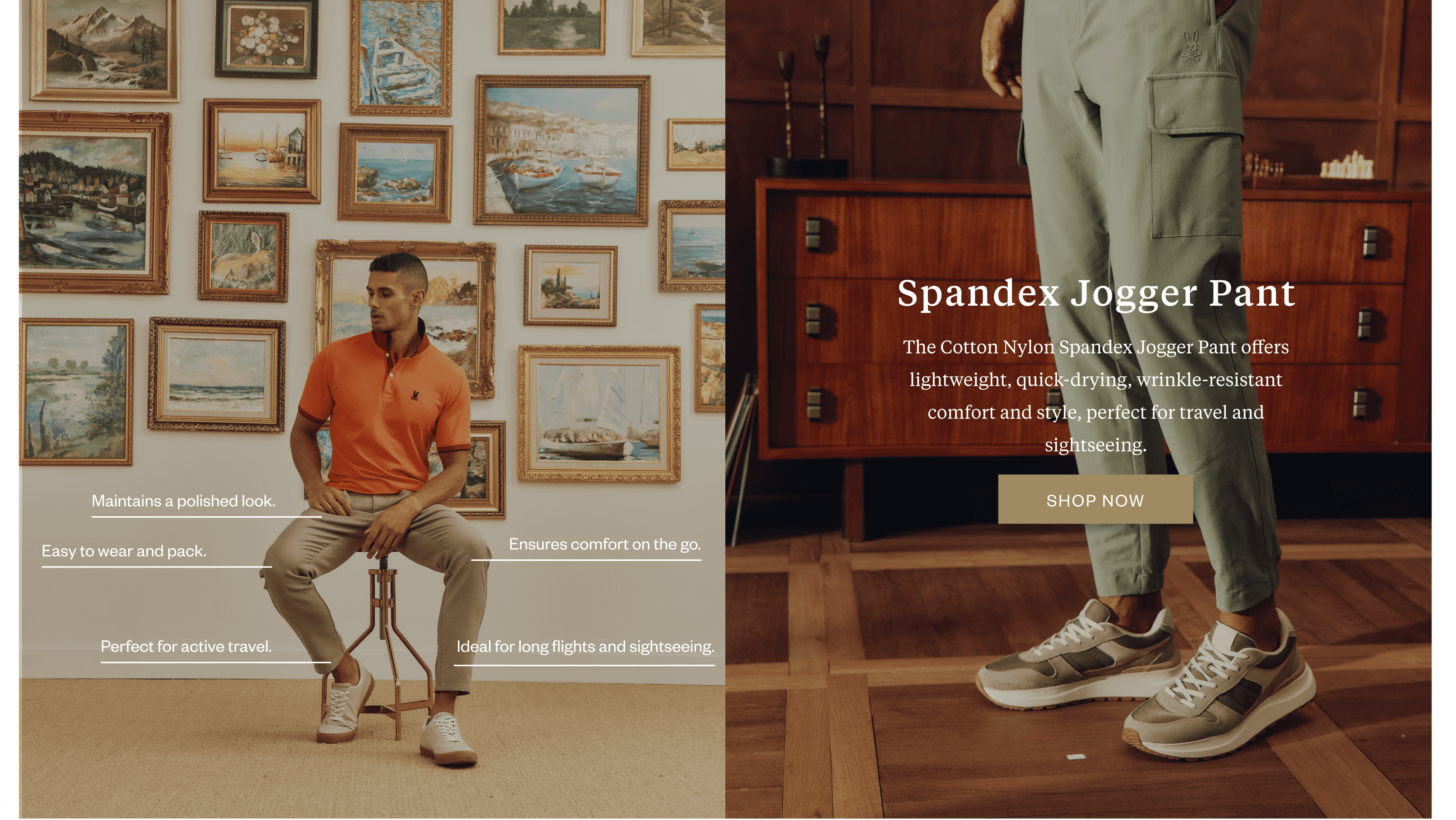
Below are images of the final envisioned product.
Below are images of the final envisioned product.
View prototype in Figma


Final Thoughts
Final Thoughts
CONCLUSION
CONCLUSION
Key Takeaways
Key Takeaways
The redesigned PLP, collection pages, and search bar were successfully implemented, enhancing product discoverability and user experience.
The redesigned PLP, collection pages, and search bar were successfully implemented, enhancing product discoverability and user experience.
Conducting competitive analysis, user research, and a SWOT analysis helped shape data-driven decisions aligned with industry best practices.
Conducting competitive analysis, user research, and a SWOT analysis helped shape data-driven decisions aligned with industry best practices.
Explore more case studies


Designed by Marc De Canaga
Designed by Marc De Canaga
Thank you for viewing my work
Thank you for viewing my work