my india holiday.


User Retention
+60%
Increased user retention with clearer content, intuitive navigation.
Form Submissions
+40%
Boosted inquiries through persistent CTAs, simplified forms, and trust-building design elements.
Pages per Session
2
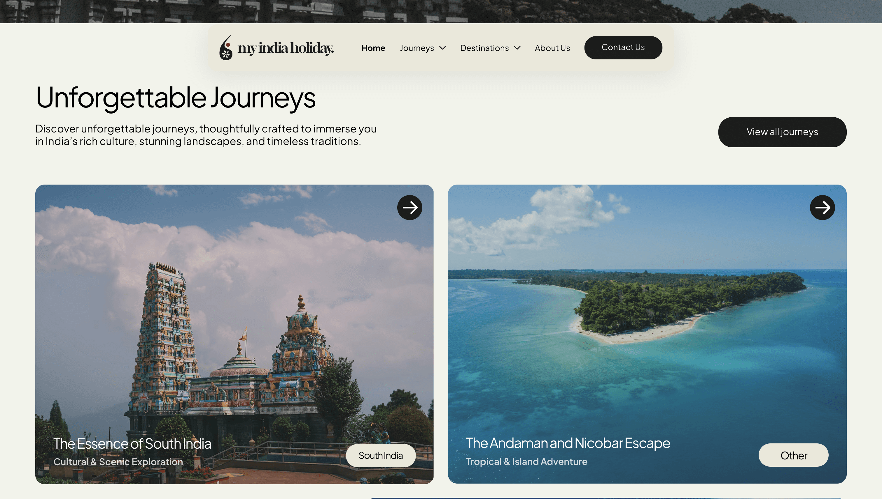
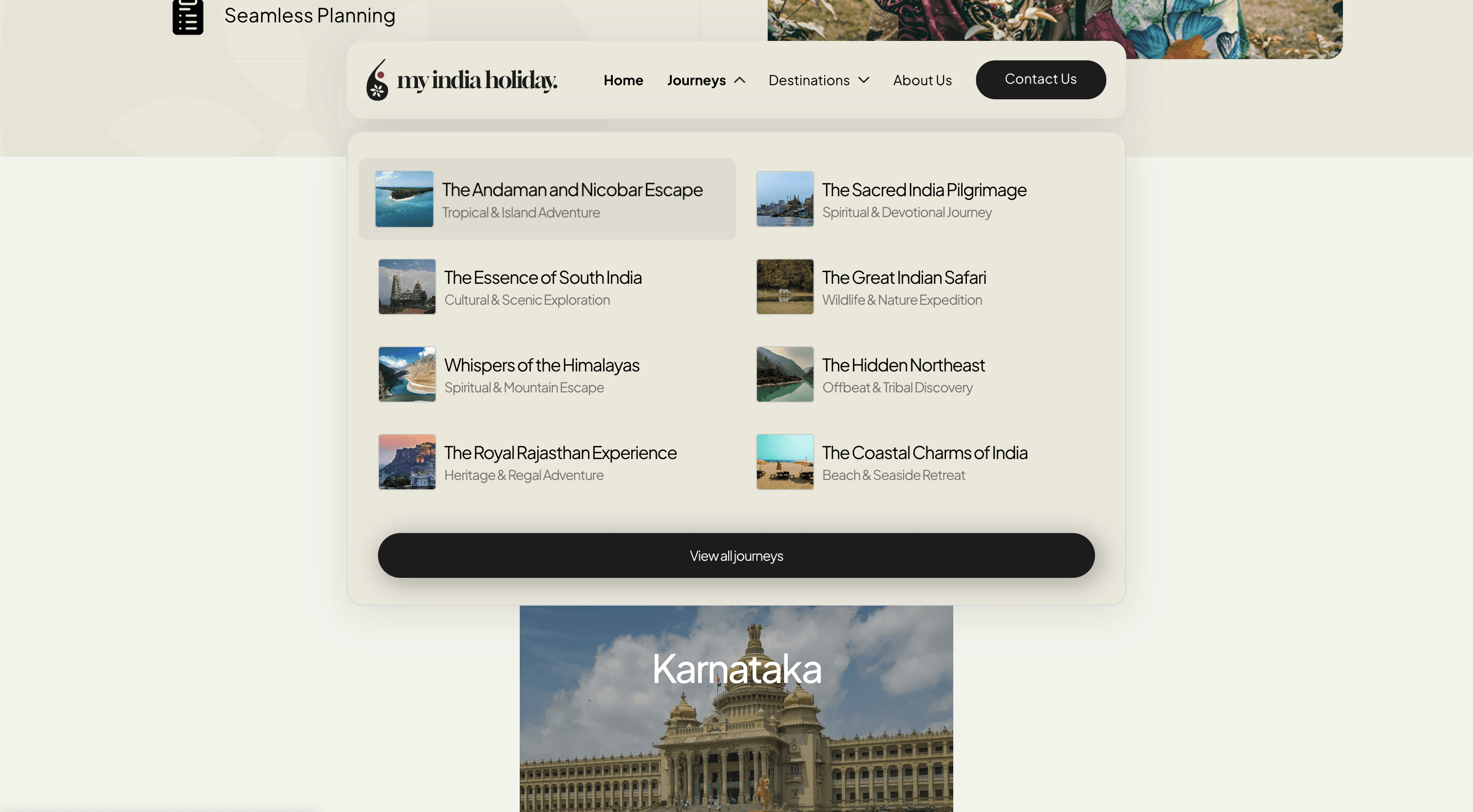
Encouraged deeper exploration by adding related journeys, day-by-day highlights, and themed browsing.
Average Session
30 secs
Extended session time through engaging content, skimmable layouts, and a smoother user flow.
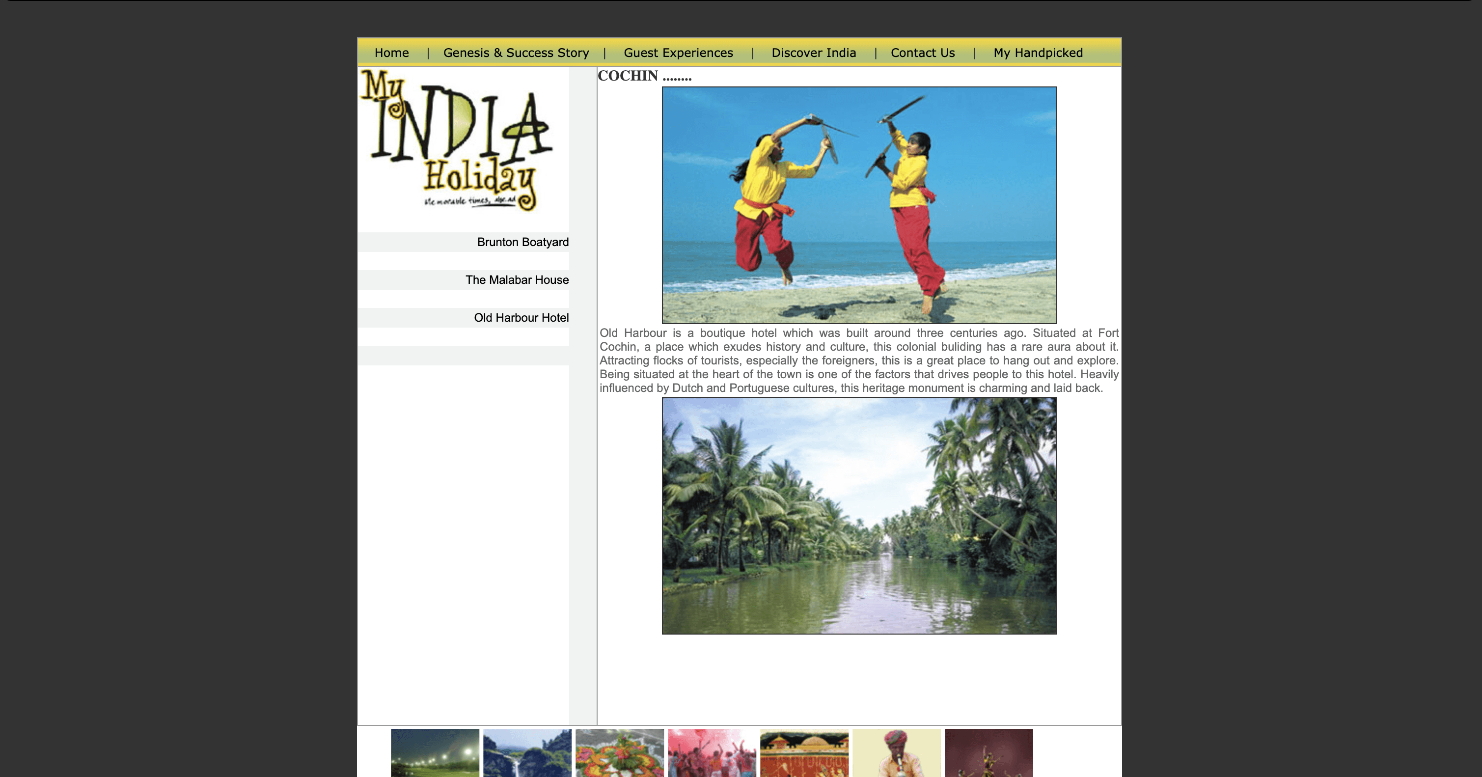
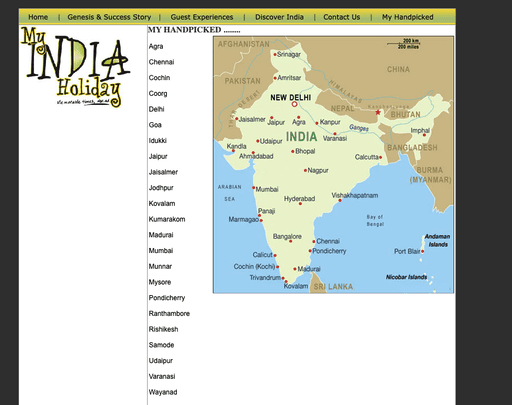
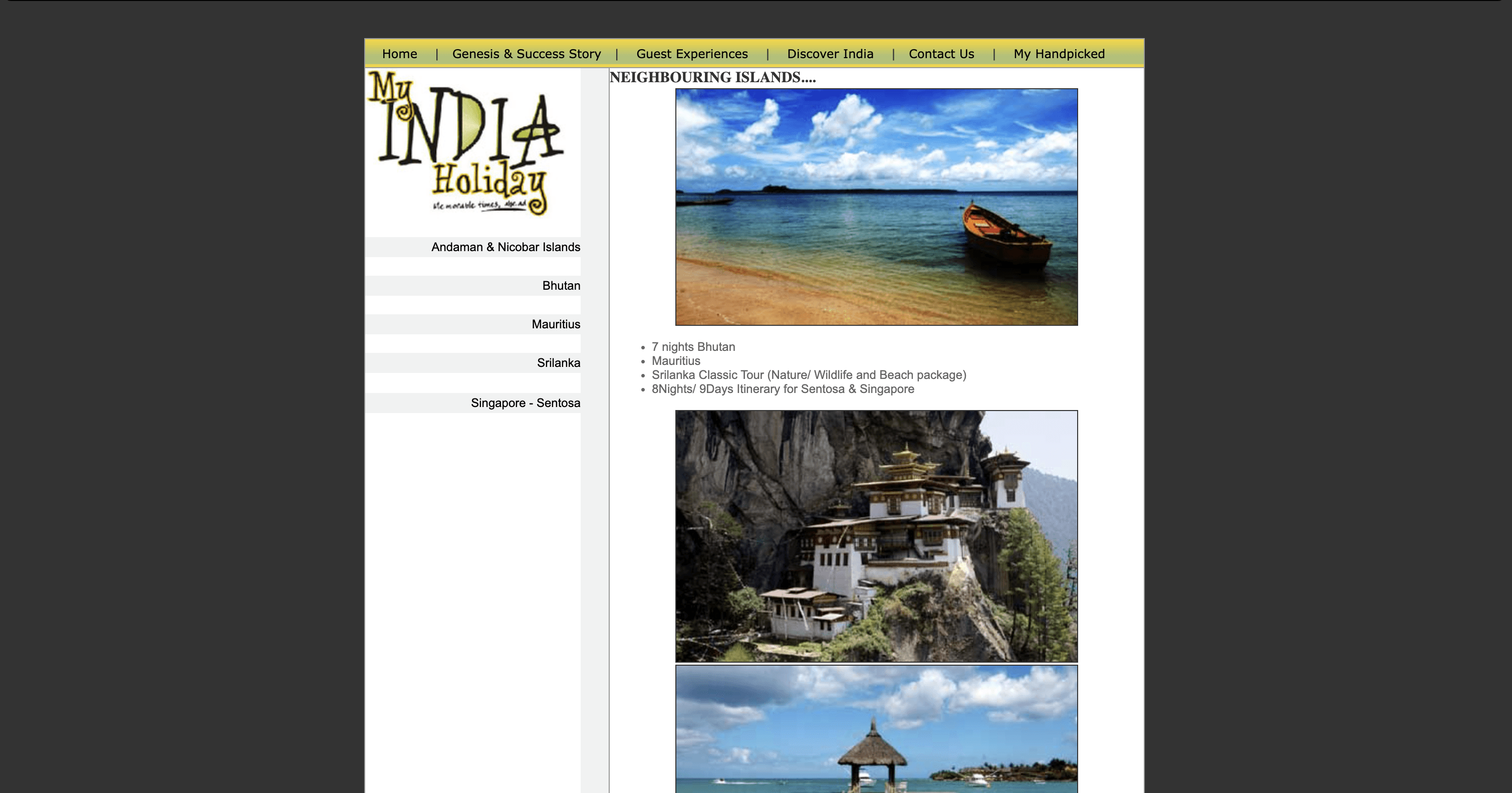
Before
After
1.Lack of Clarity Between Offerings

What Do Users Expect From a Great Travel Website?
After speaking with the founder of My India Holiday, I created a comprehensive presentation that combined all foundational research.
I conducted user research through 3 remote interviews and surveys with 20 participants, including avid travelers, individuals who have visited India, and those who haven't, to gather a diverse range of perspectives and expectations.
Here are the key insights from user research that shaped the design direction:

Human Interaction Before Booking
Users feel more confident reaching out to a planner before making any travel commitments.

Clarity Over Clutter
Confusing layouts and dense content makes users feel overwhelmed and unsure of where to go next.

Visuals and Storytelling Matter
Authentic photography, real stories, and themed journey titles deeply influence user engagement and interest.

Practical Details Build Trust
Maps and clear activity lists help users better understand what they’re booking.
What Sets Great Travel Websites Apart?
A competitive analysis was conducted to understand how leading travel websites help users explore destinations, discover curated journeys, and confidently plan their trips.
Here are the key findings that emerged:

Flexible Browsing Paths
All competitors allow flexible browsing by journey type or destination giving users control over how they explore.

Seamless Site Navigation
Breadcrumbs and intuitive navigation keep users oriented across multi-level travel sites.

Clear Itinerary Highlights
Bullet-point journey overviews and day-by-day breakdowns make complex itineraries easy to scan and understand.

Personalized, Inquiry-First
Competitors focus on personalization and encourage contact over instant booking to build relationships first.

After presenting the research and getting approval to move forward, I began ideating features based on user insights.
With constraints like hiding prices and limiting itinerary details, the focus shifted to sparking curiosity and driving inquiries through strategic design.
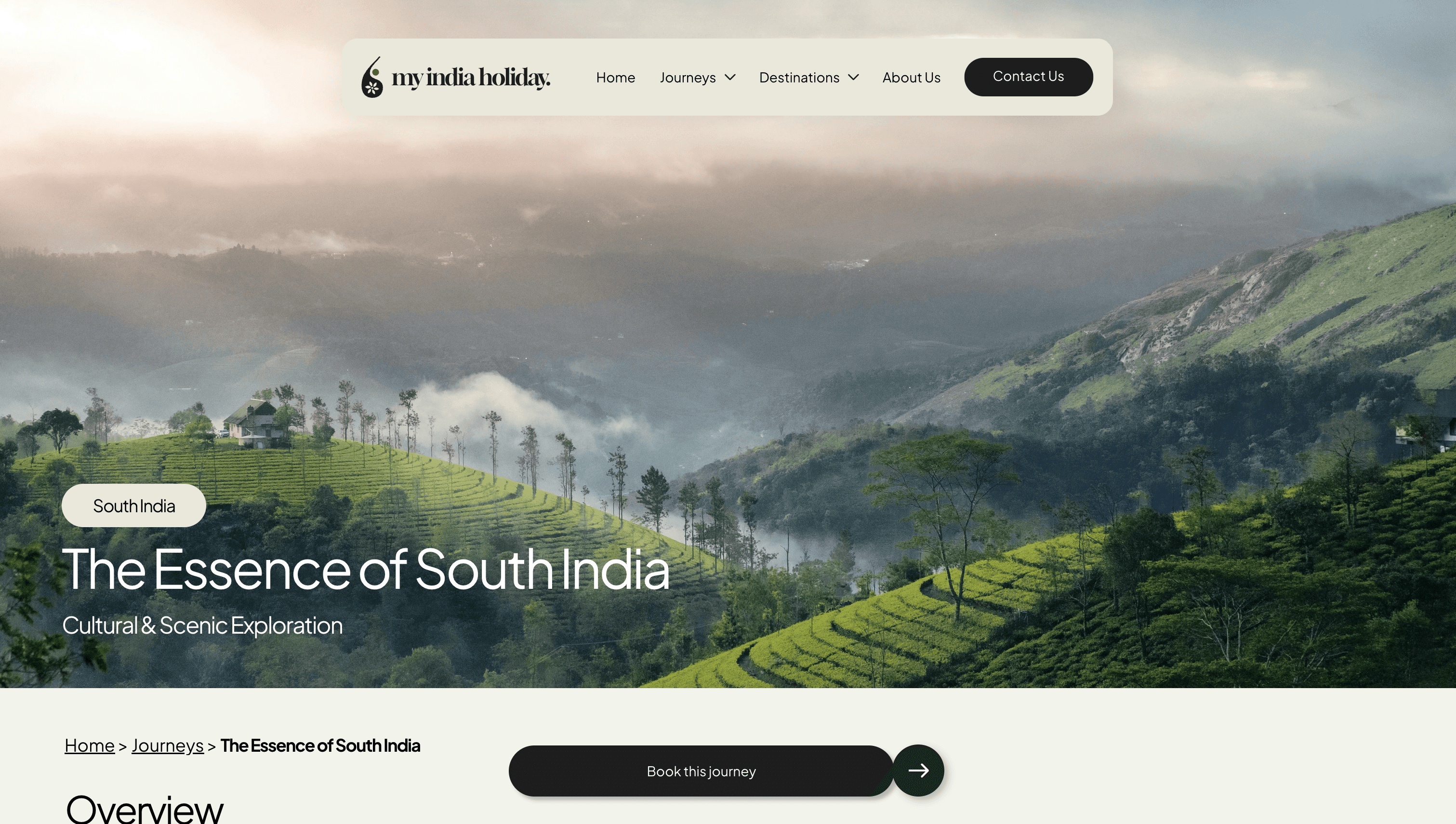
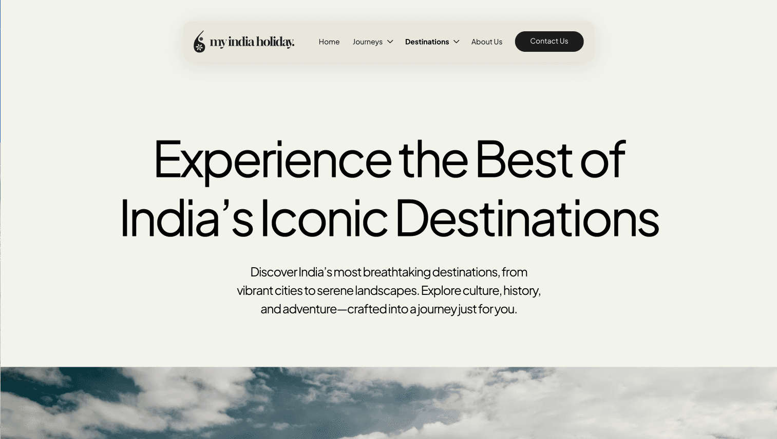
To improve clarity, I separated journeys and destinations visually and added dropdowns in the navigation to highlight their differences at a glance.
Journeys
Destinations
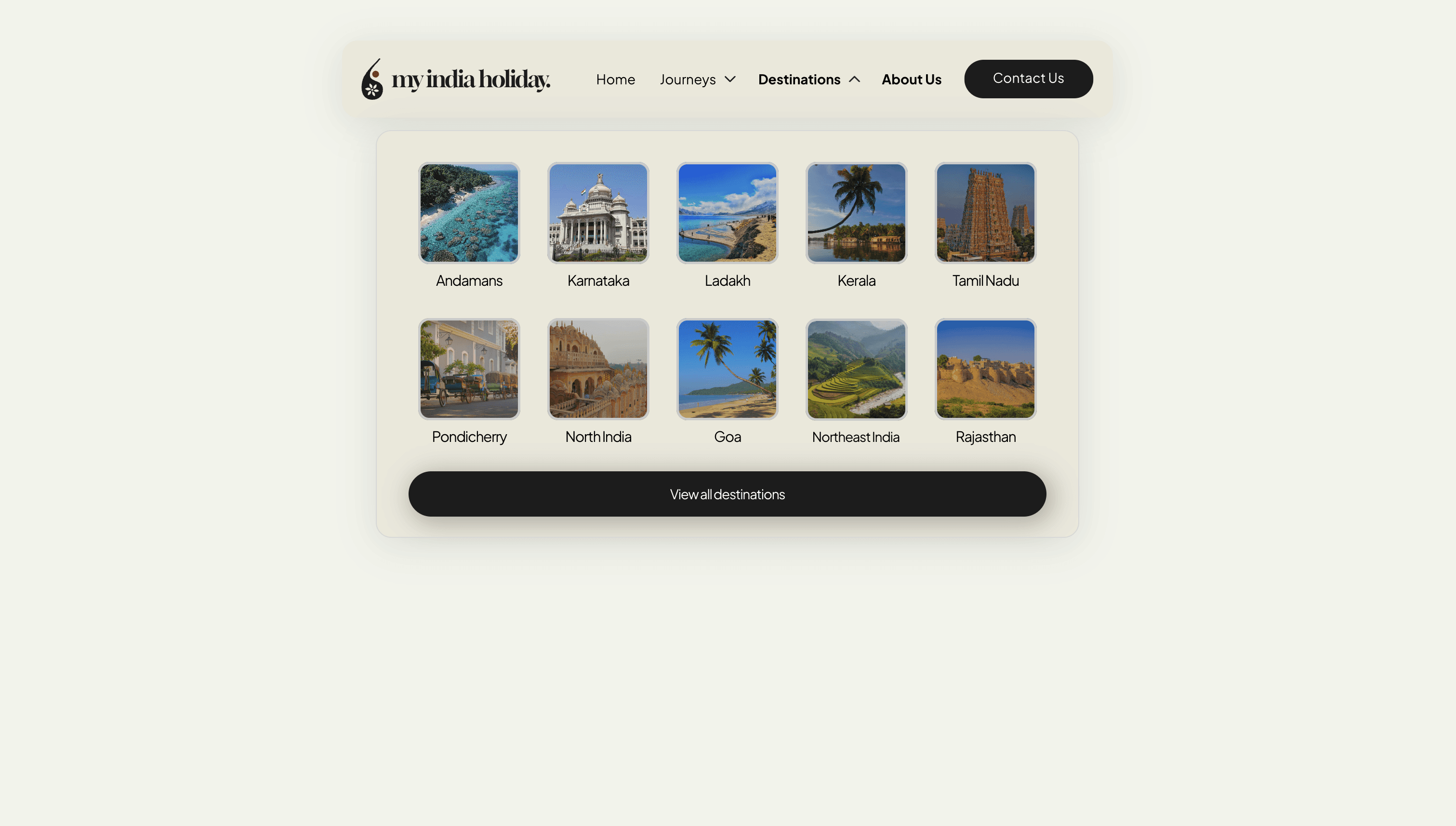
To improve navigation and layout, I simplified the site structure by adding breadcrumbs and reducing visual clutter, making it easier for users to browse and take action.
Before
After
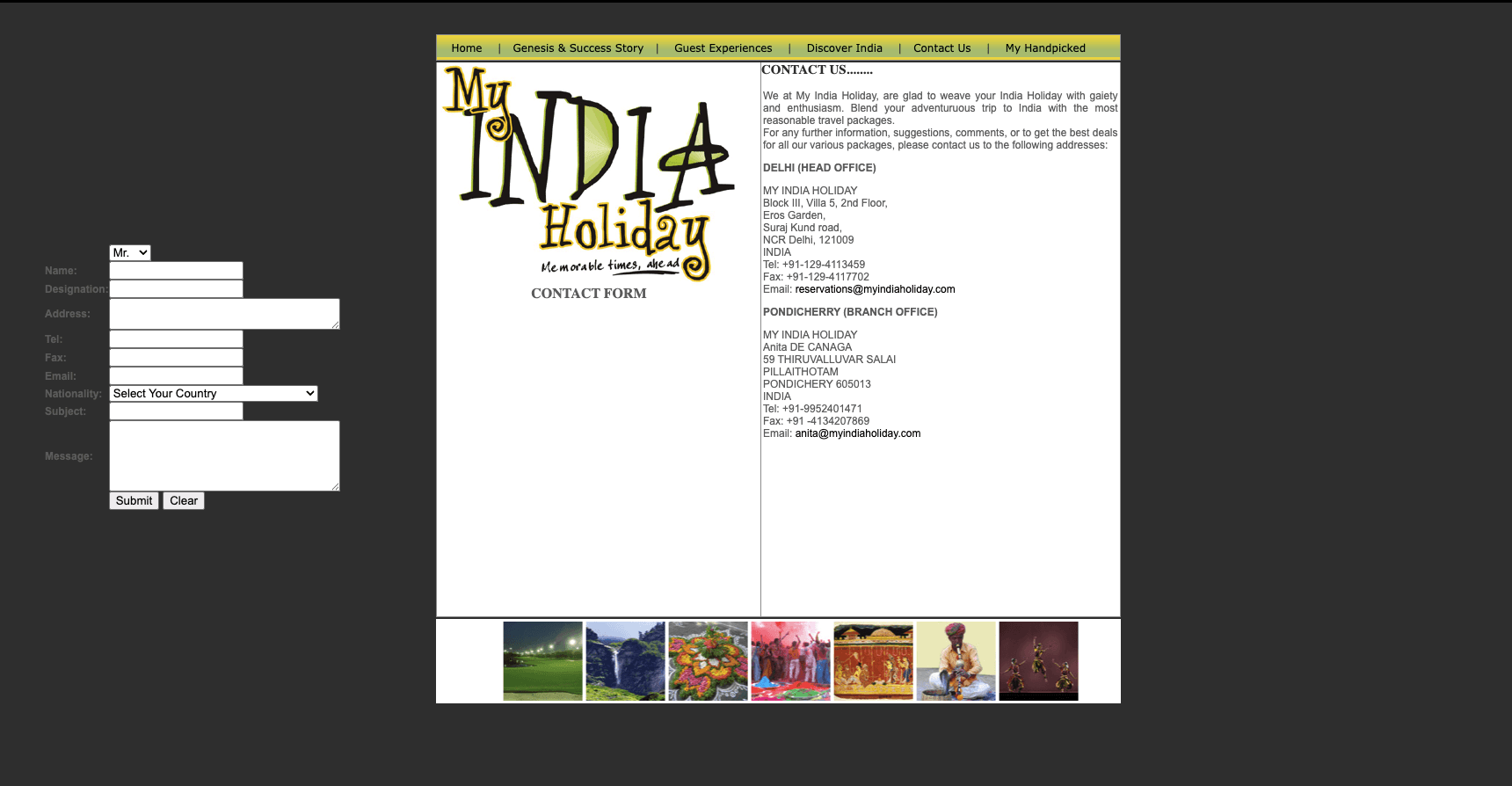
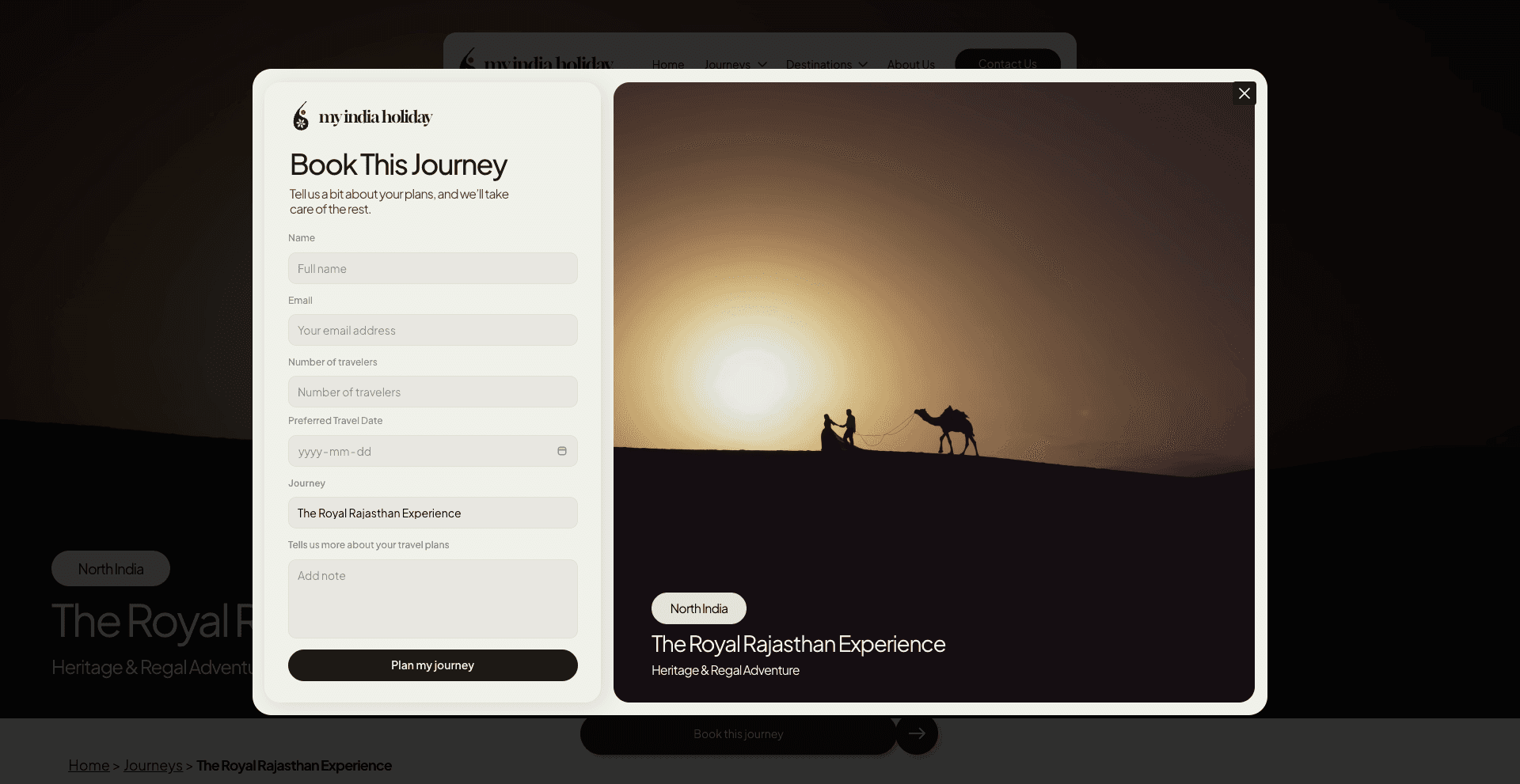
To boost inquiry conversions, I designed a streamlined "Contact Us" form, allowing users to express interest in a journey directly through the site with minimal friction.
Before
After

I coordinated usability testing with five remote testers hired by the client to gather feedback on the website.
I used the Task-Based Usability Testing method to evaluate My India Holiday by identifying key user tasks;

Addressing Usability Challenges
Building the form
After testing the website, I focused on the major usability issue: users leaving the site feeling confused after clicking "Book a Journey." To solve this, I replaced the email trigger with a built-in form to streamline the booking process.
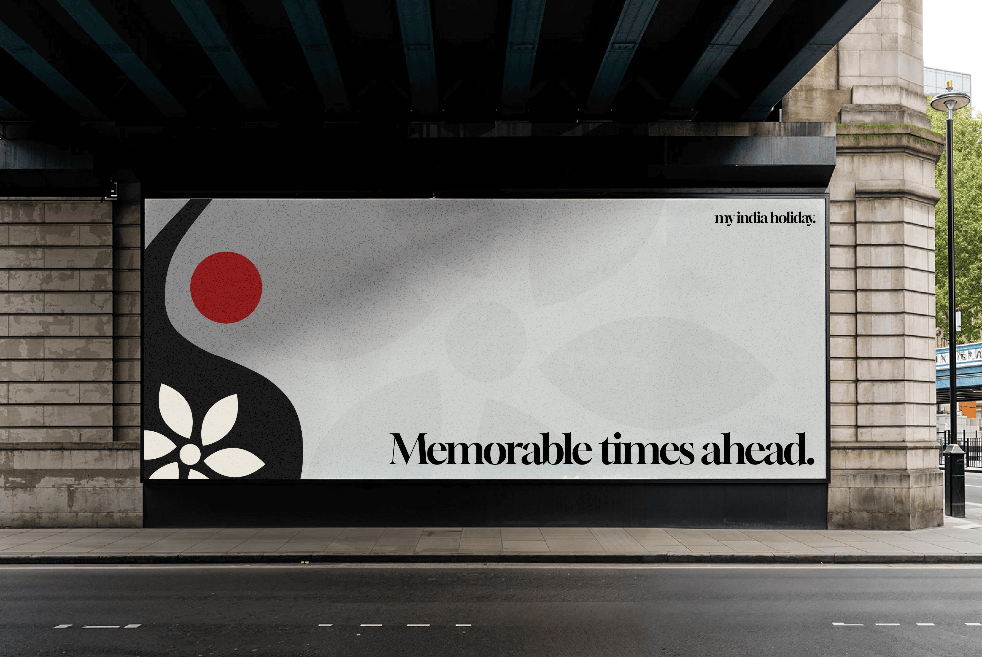
Logo Design
For the logo, I combined a Diwali lamp, jasmine flower, and bindi to create a minimalist yet meaningful mark.
The lamp symbolizes light and celebration, the jasmine flower represents purity and hospitality, and the bindi reflects cultural identity and femininity added as a subtle nod to the founder, who is a woman deeply connected to Indian tradition.
Together, they capture the essence of India in a simple, elegant design.

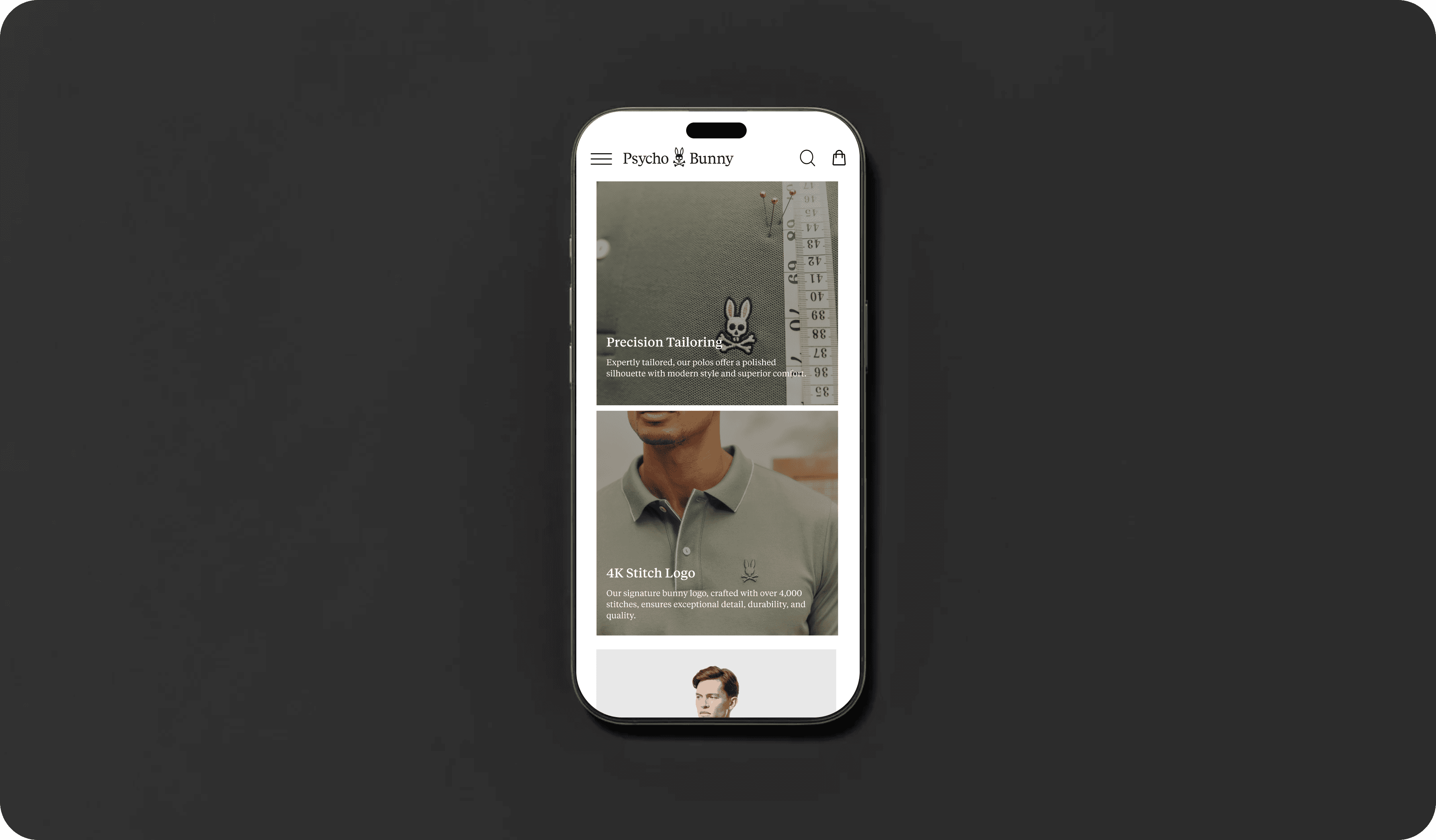
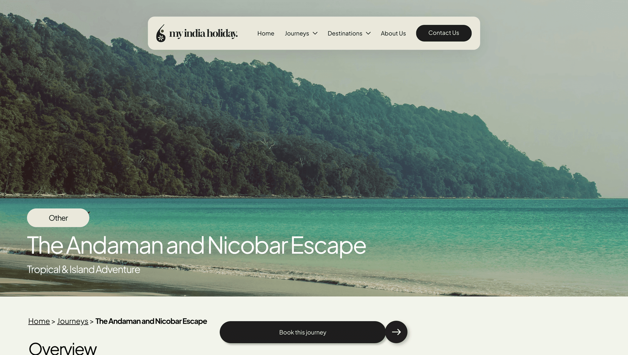
The Final Product
INTRODUCING MY INDIA HOLIDAY
Bringing It All Together
Below is a selection of screens showcasing the final My India Holiday website. You can also explore the live site by clicking the button below.
Visit website

The redesign turned a previously unclear site into a user-friendly, visually engaging experience. Clear separation of journeys and destinations improved navigation, while a streamlined layout, mobile optimization, and inquiry form boosted retention and engagement all within the client’s constraints and brand vision.
A robust filtering system for journeys and destinations could improve discoverability as content grows. Filters by region, interest, or duration would enhance usability, along with further testing to refine accessibility and micro-interactions.
Explore more case studies